-
text
1844
notes The Day I Saw Van Gogh’s Genius in a New LightThe other day, I was asked to speak at the Hokkaido Color Universal Design Organization. At the HCUDO there is a facility named the “Color Vision Experience Room” and I had a chance to experience it firsthand. The event I spoke at had, as its main objective, public education about diversity of color vision. The event also sought to promote the idea that any time we make choices about colors, for example in design, business, and education, we should take this diversity into account.
The “Color Vision Experience Room” uses illumination that is optically filtered to provide a modified spectrum of light. Under this filtered light, a person who has normal color vision sees color much the same as the person who has protan or deutan color vision. These types of color deficiency make it difficult to differentiate certain color combinations. The effort and thought that went into the construction of this room was impressive.
I was able to view various items in the room, and it turned out that experiencing modified color vision with the naked eye had a stronger impact than experiencing it on a computer display in simulation, something of a surprise to me.
There were prints of Vincent van Gogh’s paintings in the room. Under the filtered light, I found that these paintings looked different from the van Gogh which I had previously seen. I love van Gogh’s paintings and have been fortunate to view a number of the originals in various art museums. Vincent van Gogh has, is well known, a somewhat unusual way to use color. Although his use of color is rich, we see lines of diverse colors existing concurrently. Sometimes a point of entirely different color suddenly is interjected. Some people conjecture that van Gogh had color vision deficiency.
However, in the van Gogh images seen in the color vision experience room, to me the incongruity of color and roughness of line quietly disappeared. And each picture had changed into one of brilliance with very delicate lines and shades. This was wonderful to see and experience.
The next day, I had a dinner with the people of HCUDO, and we talked about this phenomenon. One of my friends who has protanomal color vision, a designer and painter, said this to me:
“It’s wonderful, isn’t it? We color deficient people, actually better than color normal people, understand van Gogh’s true nature and appreciate he is the genius of geniuses. In our opinion, van Gogh surely had color vision deficiency. Therefore, color deficient people can better understand his pictures.”
I considered this. After returning home, I viewed van Gogh’s works using the “Chromatic Vision Simulator” software which I had developed. However, the images simply lost their color and the sublime impression I got in the “Color Vision Experience Room” was missing.
Then it occurred to me to ask - Is my friend partially color vision deficient (anomalous trichromat)? Perhaps using a strong color vision deficiency (dichromat) simulation was the wrong approach. How about carrying out the simulation by removing only a specific portion of normal color vision, maybe then I could see van Gogh’s works in that light?
I have developed an app for experiencing differing types of color vision called the “Chromatic Vision Simulator,” with versions for iPhone, iPad, iPod, and Android. It is limited to simulating only dichromats (protanope, deuteranope and tritanope). In the original version it had a slider, wherein one could modify the middle range of color of dichromatic vision versus normal color vision. However, I removed the slider from the newest version due to a request from a color vision specialist: “The slider should be deleted because color vision of an anomalous trichromat is not simulated by simple linear transformation–it may create misunderstanding to those using the software.” (*2013/06/11 “Chromatic Glass” Ver.2.0 is supporting the simulation ratio slider on the simulation mode.)
Following my experience in the “Color Vision Experience Room,” I decided I should use this software as the basis for a new application that would allow for side-by-side color vision simulation. Since this software is a web application, I may exhibit it in the future. (*2013/06/27 The “Chromatic Vision Simulator - Web Edition” Ver.1.1 was released.) It is able to map a middle color - one between the color a protanope sees and the color a color normal individual sees. I applied to it to van Gogh’s works. The results are shown below (with my personal comments - note that I do not claim deep knowledge of art!)
To illustrate the simulation performed here, consider the meaning of “Protanomal simulation (60%).” This is, when an original color is Qc and the simulation color of protanope is Qp where linear transformation is possible between XYZ color space, the new color is Qc(1 - 0.6) + 0.6Qp.
Such a transformation will provide a color closer to the color which protanope sees. This color may not necessarily be the same as the color a protanomal (and other anomalous trichromat) sees but it is a useful starting approximation. As time allows, one test improvement I am considering is to run the simulation for deuteranomal color vision. However, for the time being, I have run it with protanomal simulation. Below I provide some sample pictures which in my opinion best illustrate the sort of color shift referred to in this article.
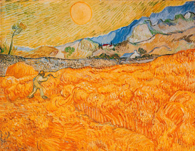
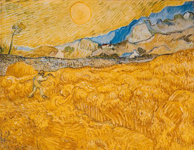
“Wheat Field Behind Saint-Paul Hospital” (F619)
In the original, what should be wheat is an orange field; above we have green lines mixed with solar light. In the protanomal simulation, the wheat shade backs up the overall presence splendidly and has given depth to the scene. With the reduced sun, I feel that the twilight of autumn is reproduced.
Left: Original / Right: Protanomal simulation (60%)
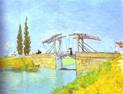
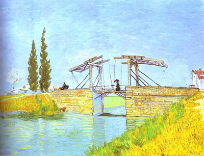
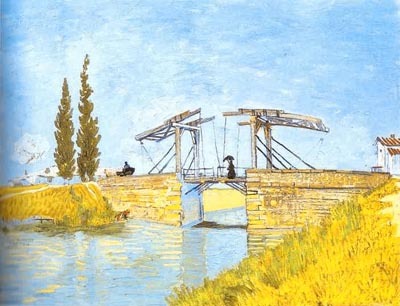
“The Langlois Bridge at Arles” (F570)
A Lady with a Parasol Crossing the Bridge. In the original, the bridge is reflected in the river but it is somewhat surreal. However it projects more naturally in the protanomal simulation. The water surface shimmers with small waves.
Left: Original / Right: Protanomal simulation (60%)
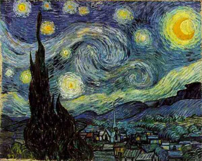
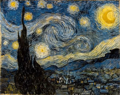
“Starry Night” (F612)
Overall force increased in “The Starry Night.” Contrast the deep darkness and starlight. Clouds are illuminated in the moon.
Left: Original / Right: Protanomal simulation (60%)


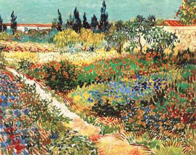
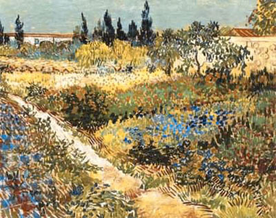
“Flowering Garden with Path” (F429)
The scene with Flowering Garden begins to take on a photographic reality. The scene has gained depth, so that it gives the impression of an overlook.
Left: Original / Right: Protanomal simulation (60%)

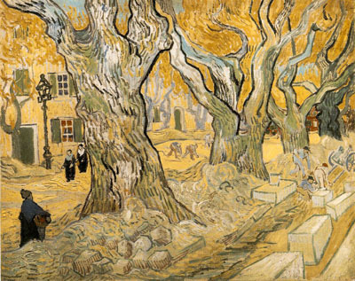
“The Road Menders” (F657)
In the original, the color of the trees and ground is bit strange, and coarse lines are conspicuous in the stones. But after conversion, the trees and the ground begin to look solid, with greater depth felt for the road.
Left: Original / Right: Protanomal simulation (60%)

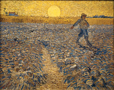
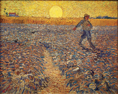
“Sower with Setting Sun after Mille” (F422)
It was truly impressed by “The Sower.” A field in the early-evening. Unevenness of the ground is compared with the light of the sun on the horizon. A farmer casts a shadow. The clods become solid. It seems that footsteps could almost be audible.
Left: Original / Right: Protanomal simulation (60%)

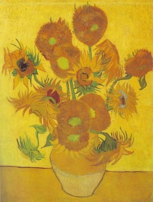
Another highlight is “The Sunflower.” Flowers are more tangible. The Sunflower is such a wonderful picture.
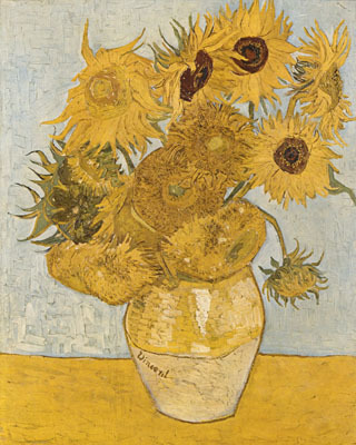
“Sunflowers” (F456)
Left: Original / Right: Protanomal simulation (60%)

“Sunflowers” (F458)
Left: Original / Right: Protanomal simulation (60%)
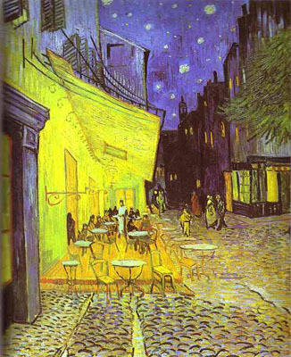
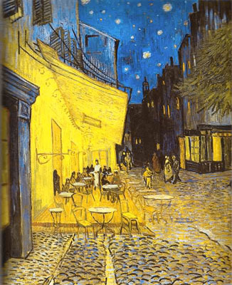
“The Cafe Terrace on the Place du Forum Arles at Night” (F467)
In “The Cafe Terrace at Night,” each of the stones in the pavement become more solid. The building of the slender cafe’s terrace emerges with depth in the moonless night. Under the stars in the infinite sky, people relax and are enjoying a meal and drinks. And the warm light illuminates them.
Left: Original / Right: Protanomal simulation (60%)
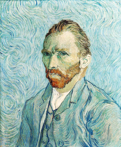
A self-portrait. Stern expression—the man whom one cannot approach easily. Though suffering is held, his aloof and proud figure which dies without compromise emerges further. It speaks to me.
“Self-Portrait” (F627)
Left: Original / Right: Protanomal simulation (60%)

In summary, through the use of this software, I feel that van Gogh’s astounding use of color has become more available to me.
This is something not noticed by the color normal individual, and a dichromate may not notice either. Only an anomalous trichromat, somewhere between dichmomat and normal color vision, may notice it.
Viewing works of van Gogh under this sort of simulation is an exemplar of “the color deficient individual is sometimes superior to the color normal color individual.” This shows those of us who may think, “the color normal individual is superior to the color deficient individual (from the point of seeing and understanding color).” It reminds us that it is normal for one human being to excel in certain ways, while another excels in other ways.
It is reasonable to think that color vision varies by individual nature. I think it is also reasonable to imagine that, possibly, van Gogh’s color vision also differed from normal or “ordinary,” and that he formulated rules how to choose and use paints which were optimal to his eyes.
Of course, the premise of this guess may be wrong. Regardless of whether this hypothesis is correct or incorrect, the fact that his work is wonderful and appeals to many people does not change a bit. I have enjoyed imagining that we can see his work with his own eyes.
Disclaimers: Terms, such as dichromat, anomalous trichromat, normal color vision, protan, protanope, protanomal, deutan, deuteranope, deuteranomal and tritanope are technical terms. The simulation procedure used here does not necessarily reproduce the correct spectrum of the color seen by the color vision deficient.
Please see page 31 of my thesis ”Color vision tools to improve quality of life of people with color vision deficiency” about the details of the simulation procedure used. (Japanese language only.)
(2011/10/16 17:00 the first edition, 2013/08/02 the latest edition, the original Japanese edition was written on 2011/10/12 03:35)
Please contact Mr. Koichi Iga (executive board member of Color Universal Design Organization) if you would like to know more about the “Color Vision Experience Room.” Use the form in his blog.
Kazunori AsadaWeb Site:http://asada.tukusi.ne.jp/
randomschtuffrepository reblogged this from asada0
jellomortality liked this
violetdale liked this
 mobizo reblogged this from talvenhenki
  talvenhenki reblogged this from gremlinbehaviour
 tassium liked this
defiantly-whole reblogged this from capribornio
 expecto-ambulatorium liked this
 musicmystery1 reblogged this from capribornio
coolartandphotos reblogged this from capribornio
bogofbeans liked this
gremlinbehaviour reblogged this from faggotisaacfloofs
aloe-mira reblogged this from faggotisaacfloofs
thedragonofmajima liked this
faggotisaacfloofs reblogged this from lorax177
 capribornio liked this
 - capribornio reblogged this from lorax177
lorax177 reblogged this from asada0
littlemintbunny642 liked this
 magicaltacoshoefish reblogged this from asada0
 - magicaltacoshoefish liked this
scheherezhad reblogged this from saekhwa
saekhwa reblogged this from maharetr
anankasis liked this
valiantfoxdinosaur reblogged this from asada0
beetrans liked this
stitchingatthecircuitboard liked this
 mishafletcher reblogged this from maharetr
  earnedmagic liked this
  maharetr reblogged this from asada0
  hesitantbird liked this
 dodgingthedailygrind reblogged this from asada0
diddleeeeee liked this
kcraftsallthethings reblogged this from asada0
 deengdawng liked this
 rozzychan liked this
andytehnerd liked this
 asada0 posted this
 - Show more notes