

Howdy! If this is the first post in the series that you’re seeing, here’s some background. Lately I’ve been experimenting with painting on photos, to combine two of my strongest skills as an artist. My intended process is to use pastels over fine art prints of my photographs, though I’m likely to add other media too. It’s been an interesting and very informative period of learning.
If you’re also considering painting on photos, reviewing all the parts of this series could give you a jump-start in devising your own process.
Experiment Plan for Painting on Photos
In Part One, Part Two and Part Three of this series, I selected a high-end photo printer, ordered print samples on various papers and substrates, researched painting methods, and gathered supplies. Then I conducted several experiments, using five Hahnemühle fine art photo print samples from White Wall, and their UltraHD photo print. The tests included trying tapes for masking, using soft pastel on the papers (with and without fixative), testing so-called clear acrylic gesso over the prints, applying pastels to the gesso, and texturizing the gesso using a heat gun.
Reviewing the list below, I’ve already completed steps one through six.
- Direct dry pastel application in five layers, from hardest to softest pastels.
- Another direct application in five layers, using only the softest pastels.
- Applying the softest pastel layers with fixative, for a little tooth.
- Applying Winsor & Newton Artists’ Acrylic Clear Gesso smoothly, to gauge effect alone.
- Testing the gesso with layers of pastels.
- Applying the gesso with the heat gun, to create texture.
- Testing the textured gesso with pastels.
- Layering gesso and pastels, with fixative.
- What happens if I finish the painting with a layer of gesso?
This time, I’m completing the last three steps in the plan: experimenting with mixing layers of textured gesso with pastels. In this experiment report, you’ll see I’ve mashed the last three steps together. But first…
Work Space Pointers
Speaking from some (silly) experience, I have thoughts about preparing your work space, for painting on photos with pastels:
- Cover your surface with a large piece of paper, or perhaps plexiglass, to protect it. (Careful with plexiglass and excessive heat.) Also cover the floor with something washable or disposable. The wall, too, if it needs to remain free of art-making splatters.
- Have the heat gun plugged in and ready to use, making sure the cord is long enough for free movement.
- Make sure all containers, brushes, pastels, blending tools, and other supplies, are on the other side of the table from the heat gun. Better yet, somewhere else completely.
- Ensure that you won’t be dragging the heat gun’s cord over important parts of the painting, or into supplies.
- If needed, fix the artwork (paper) to a board, to make sure it doesn’t blow around when using the heat gun.
- Apply pastel, then clean up the work space. Remove any extra pastel dust from the painting by taking it outside (yes, outside!) and gently tapping it from the back. Clean pastel dust off work surfaces with a damp cloth. Otherwise, the heat gun will make all the loose pastel dust airborne, to land wherever, and worse, to be breathed. More about working with pastels safely.
- Next, pour out some gesso in a smaller container, then CLOSE THE LID on the bigger jar.
- After applying the gesso, cover the smaller container and the brush, to keep moist and protected.
- Immediately use the heat gun to texture the gesso. Adjust temperature as needed; today I needed to turn it down to setting 3, from yesterdays 3.5.
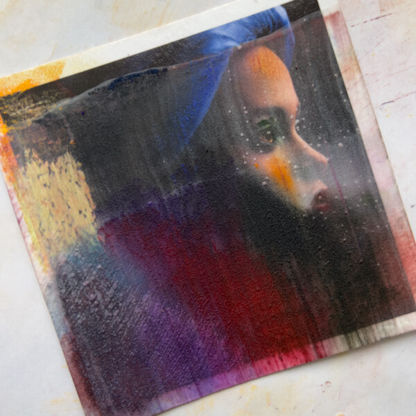
#7, 8 and 9: Textured gesso layered with pastels
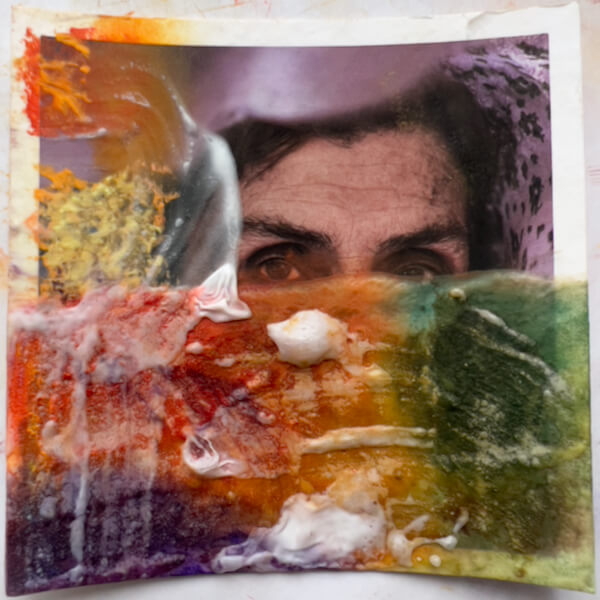
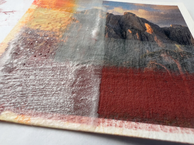
Thick Gesso, Thick Pastels
Let’s start with a closer look at one of the test surfaces I created last time, using gesso and a heat gun:
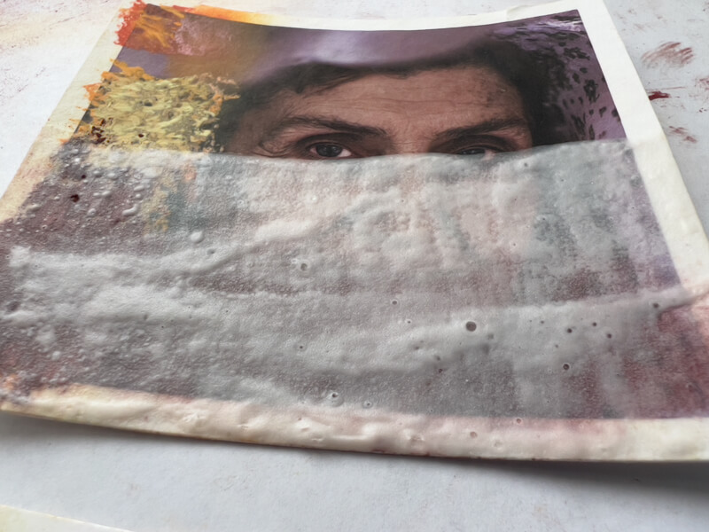
First, I applied several colors over the thick gesso, layering the pastels a little.
Next, I blended the pastels using a piece of pipe foam insulation, turning the foam to avoid polluting the colors.
Since this gesso was thicker, when I rubbed the pastel it gained a sense of depth, and took on an inner glow. This reminded me a bit of encaustics.
I like the appearance at this stage.
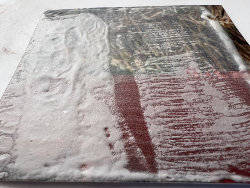
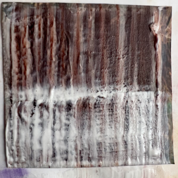
Then I applied a second thick layer of gesso rather haphazardly, just to see what would happen after texturizing with the heat gun. Yes, the brush picked up pastel dust, which was a pain in trying to keep the gesso clean. Here is the gesso, wet:
Once I’d texturized the gesso, the thickest areas left pretty large blisters, not all of which collapsed as they cooled:
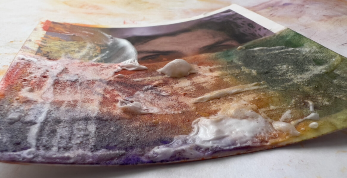
Frankly, after trying this, I don’t see a need to add a second layer of gesso. One is enough under a subsequent layer of pastels.
But let’s not stop there, these are experiments, after all!
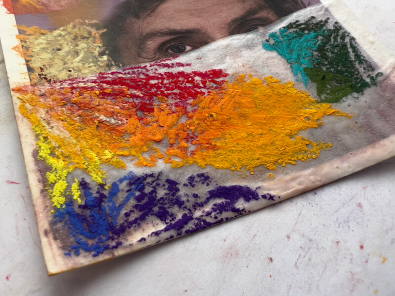
Adding Even More Layers
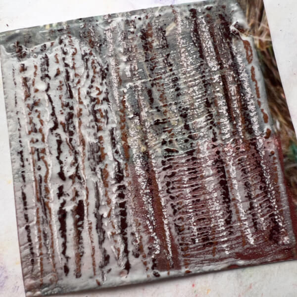
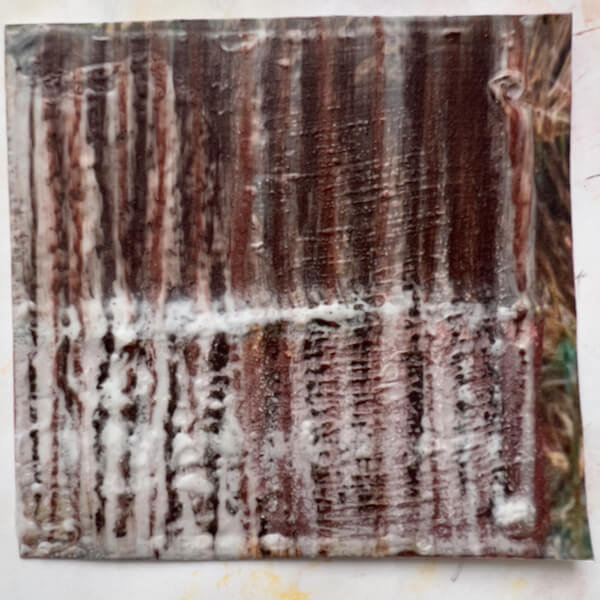
Yes, I went ahead and tried adding another application of pastels. This time, I layered the pastels quite a bit, which compressed the bubbles:
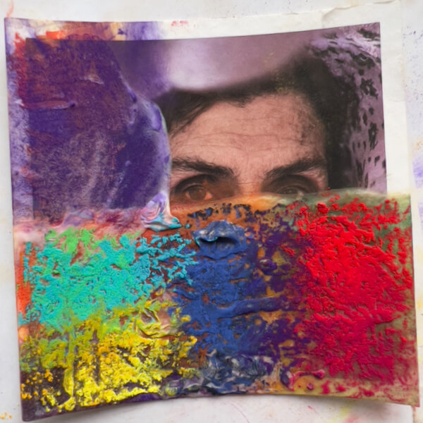
Now—with the pastels on top again, and contrasting with the previous layer of complimentary colors—this also looks interesting. At this stage, I didn’t blend the colors.
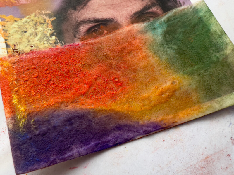
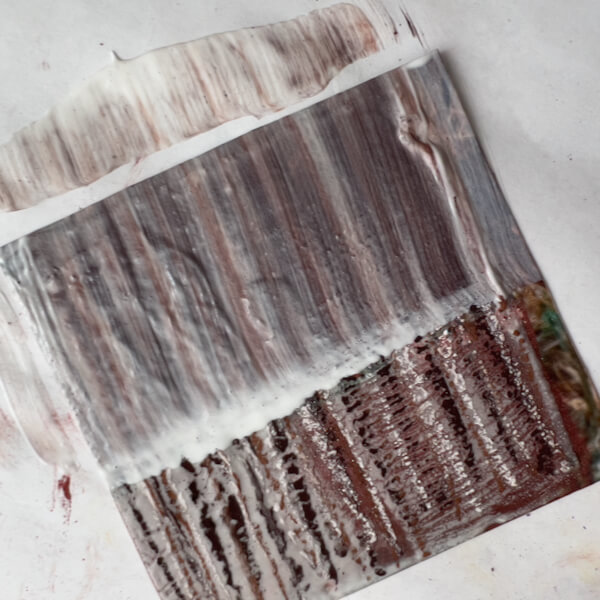
Next, just to know what happens, I again applied gesso. However, this time I applied one coat over the whole photograph…
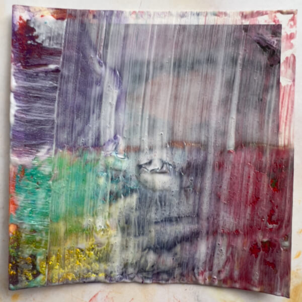
… and then I textured it again. This was the end result:
My opinion: Dull. Cloudy. Meh.
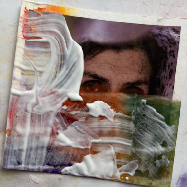
Skipping right to step #9, the answer is no, gesso should not be the final layer when painting on photos. Bummer, as it will still be necessary to apply fixative, and cover the painting with glass. (Unless I discover something else.)
Takeaways
- One layer of gesso, textured or not, can easily be enough to add interest, when painted with pastels.
- If a first layer of gesso was thinly applied, then painted or blended with pastels, a second textured layer could be useful under a second layer of pastels.
- Blending pastels looks good on a layer of thick gesso, adding depth and glow.
- Spraying the blended pastels with fixative, then applying a layer of complimentary colors and fixing again, would undoubtedly work nicely as a final layer. (I didn’t do this here.)
- Brushing gesso over pastels almost always disturbs the pastels and lifts colors.
- Anything more than a thin layer of gesso and a thin layer of blended pastels, obscures the photograph below.
Thin Layers of Gesso and Pastels
Again, starting with a surface I created last time:
Here, I applied single layers of pastels, blending some and leaving some as is. Yeah, this is ugly, but it’s not about the end result, it’s about the process:
Next, I simply painted over it with another thin layer of gesso. You can see that the pastel lifted and smeared quite a bit, leaving residue on the base paper.
I simply left this to dry without texturing.
BORING.
Takeaways
- Don’t use this method.
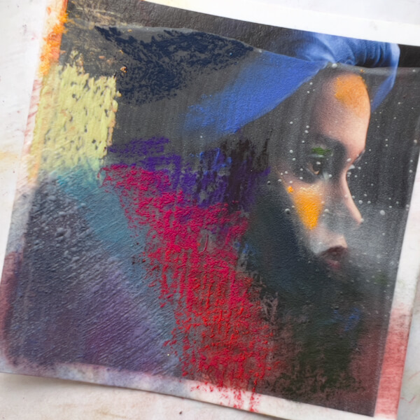
Emphasizing Texture, in Gesso and Color, when Painting on Photos
Here’s the starting texture:
This time I decided to try stress the texture. First, I applied three colors of pastels in stripes:
I think this looks pretty interesting as is, and where the gesso was thinnest, some colors and tones from the photo are slightly visible (upper right quadrant). If I apply gesso and color more sparingly, this might be effective for letting the photo come through.
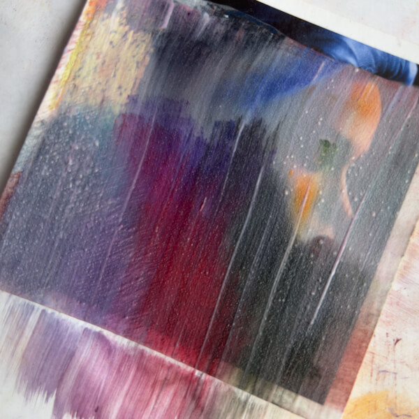
Curious about the result, I rather aggressively applied gesso over the upper half of the image, which again lifted the pastel:
After texturing this layer of gesso, you can see (below) that the pastel is quite smeared. Interesting if that’s a desired effect when painting on photos, regrettable if not.
With a much lighter touch, I applied a layer of gesso to the bottom half, so as not to disturb the pastel:
After texturing, it isn’t smeared. However, the lighter touch also meant more gesso remained:
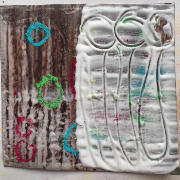
Since I’m playing with texture here, I drew a few pastel circles, applied some thick gesso, and inscribed lines in it. On the uncoated side (left), I was curious whether the pastel would kind of melt into the previous layer of gesso, if simply heated. This is before texturing:
And this if after applying heat:
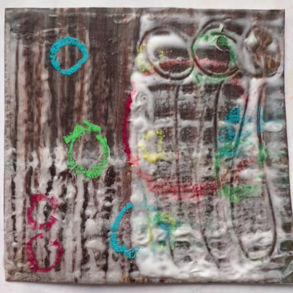
The pastel on the left did not “melt” into the surface. However, the gesso impression on the right remained, as expected.
Takeaways
- Thin gesso (textured or not) with a light application of pastel allows a little of the photo to come through.
- Purposefully textured pastel strokes over textured gesso can yield an interesting effect.
- Heavy-handed gesso application blurs the pastel, and vice versa.
- Thoughtfully applying or drawing into the gesso may add interest.
- Pastel does not “melt” into an under-layer of gesso when heated.
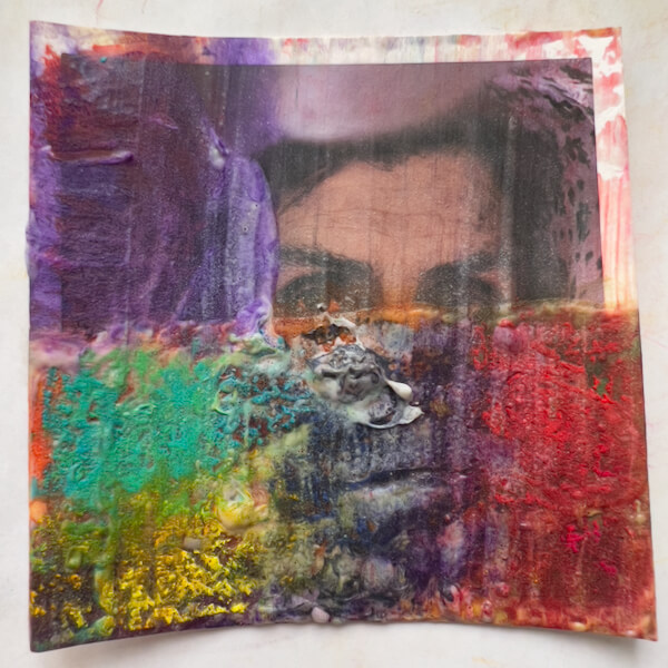
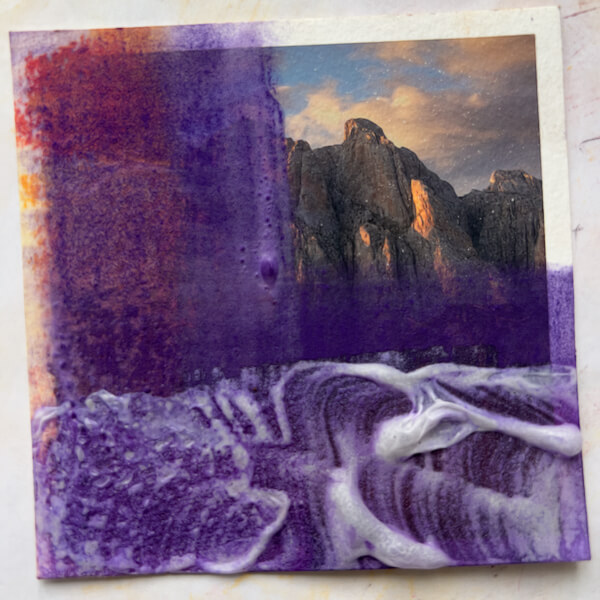
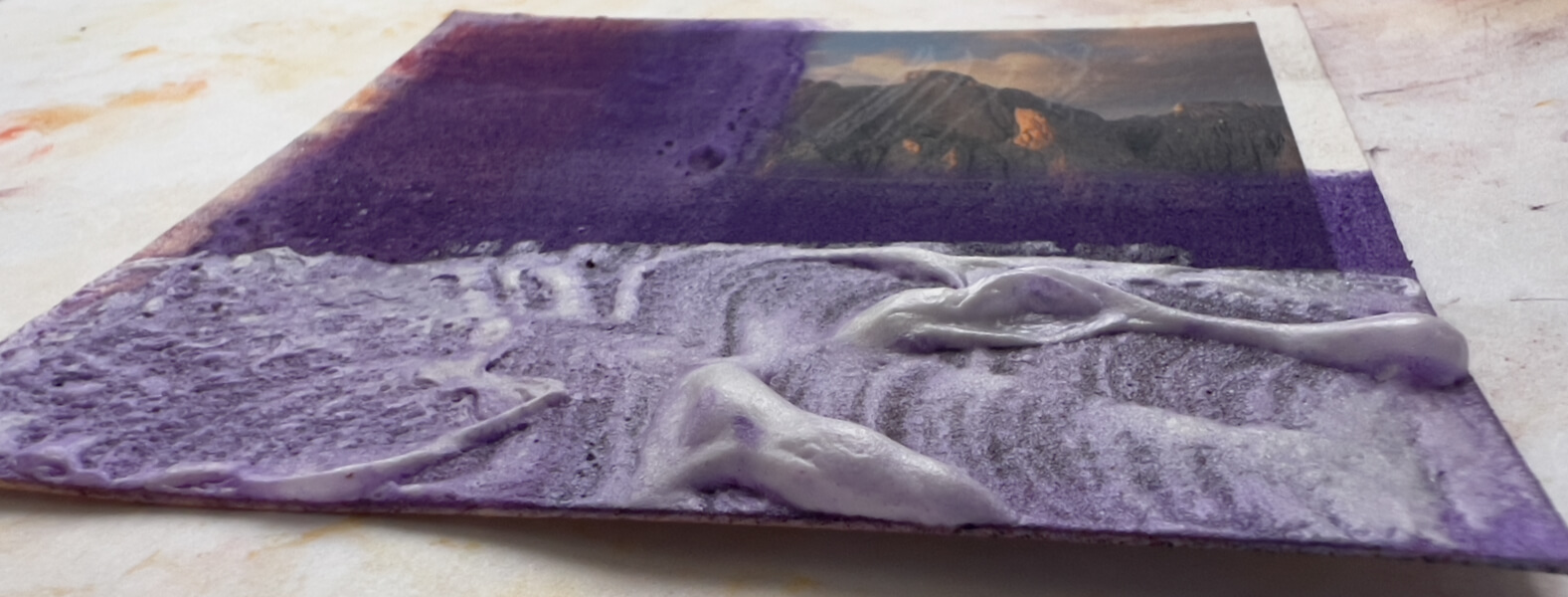
Mega-blistering
Starting with:
I then applied and blended a purple color, and painted on gesso in thick swirls:
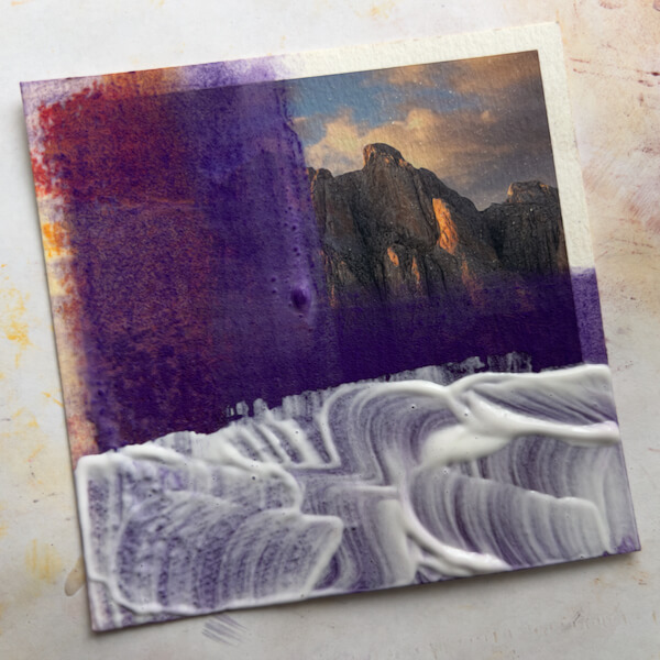
Once heated, yielded big blisters that rose and collapsed in interesting ways:
Since I’ve been playing with complimentary colors, I applied yellow:
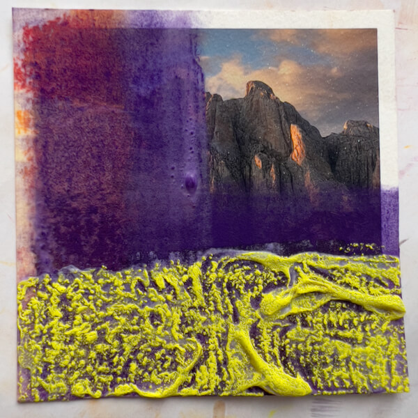
Then blended the yellow and applied gesso over half:
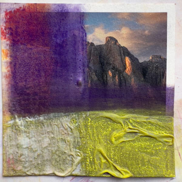
This time, the yellow seemed to disappear. I’m not sure why, maybe it’s the pigment? Maybe too much was picked up when applying the gesso?
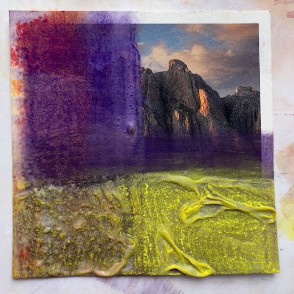
Takeaways
- Gesso bubbles can get kind of interesting, and ridiculous.
- They’re fragile, too.
- If I used fixative on the pastel before applying a second layer of gesso, it would probably remain undisturbed.
Conclusions (for this stage of painting on photos)
It’s all fun and games, until the art gets obscured.
I mean two things by that:
- Anything but a light layer of gesso and pastel will cover up the underlying photo.
- A final layer of gesso is a no-go.
That said, THIS WAS FUN! I’ve never been interested in doing abstract work, but I can see why this kind of playing-with-art-supplies leads people in that direction. I could drown myself in color and texture.
But I have other desires, goals and intentions with my art at this stage in my development. And now I’m a lot more informed about how I might proceed in painting on photographs.
Another Conclusion
None of this is necessary for painting on photos! I could simply paint directly on the Hahnemuhle Photo Rag—or one of the other receptive papers—with pastels (or other media). As I learned in Part Two, the Photo Rag will take several layers of hard-to-soft pastels, and if sprayed with fixative in between, at least five layers of the softest pastel, Schmincke.
Texturizing is interesting, though, so I’ll continue to experiment with it down the road.
I hope you found this interesting, and possibly a short-cut to developing your own processes.
Thanks for your time and attention, both are valuable. 🙏🏻
I invite you to view my photographs and paintings, and to learn more about me.
If you liked this post, you have options:
- Check out the art available in my shop!
- Buy me a coffee (I’d be so grateful!), or check out my Patreon (coming soon!).
- Sign up for my monthly newsletter, full of delicious tidbits.
- Follow my blog with RSS, using a feed reader like Feedly.
- Browse my other blog posts.
©Marlene Breitenstein. I welcome your inquiries about purchasing, licensing, or republishing my work. I take my intellectual property seriously. This post and its contents, unless otherwise noted, is owned by Marlene Breitenstein. It is not to be reproduced, copied, or published in derivative, without permission from the artist.